Rothschild & Co
Identity // Guideline // Tone of Voice
Rothschild as a group operates across an increasingly competitive set of markets where all competitors claim similar values; unique perspectives, global reach and a professional, reassuring experience from a historic family or partnership. Our challenge was to create a new visual identity and design system that supported a new brand architecture (including a name revision) and aligned to the new positioning crafted by Clear. We provided an identity and design system that enabled the businesses to communicate their difference to clients.
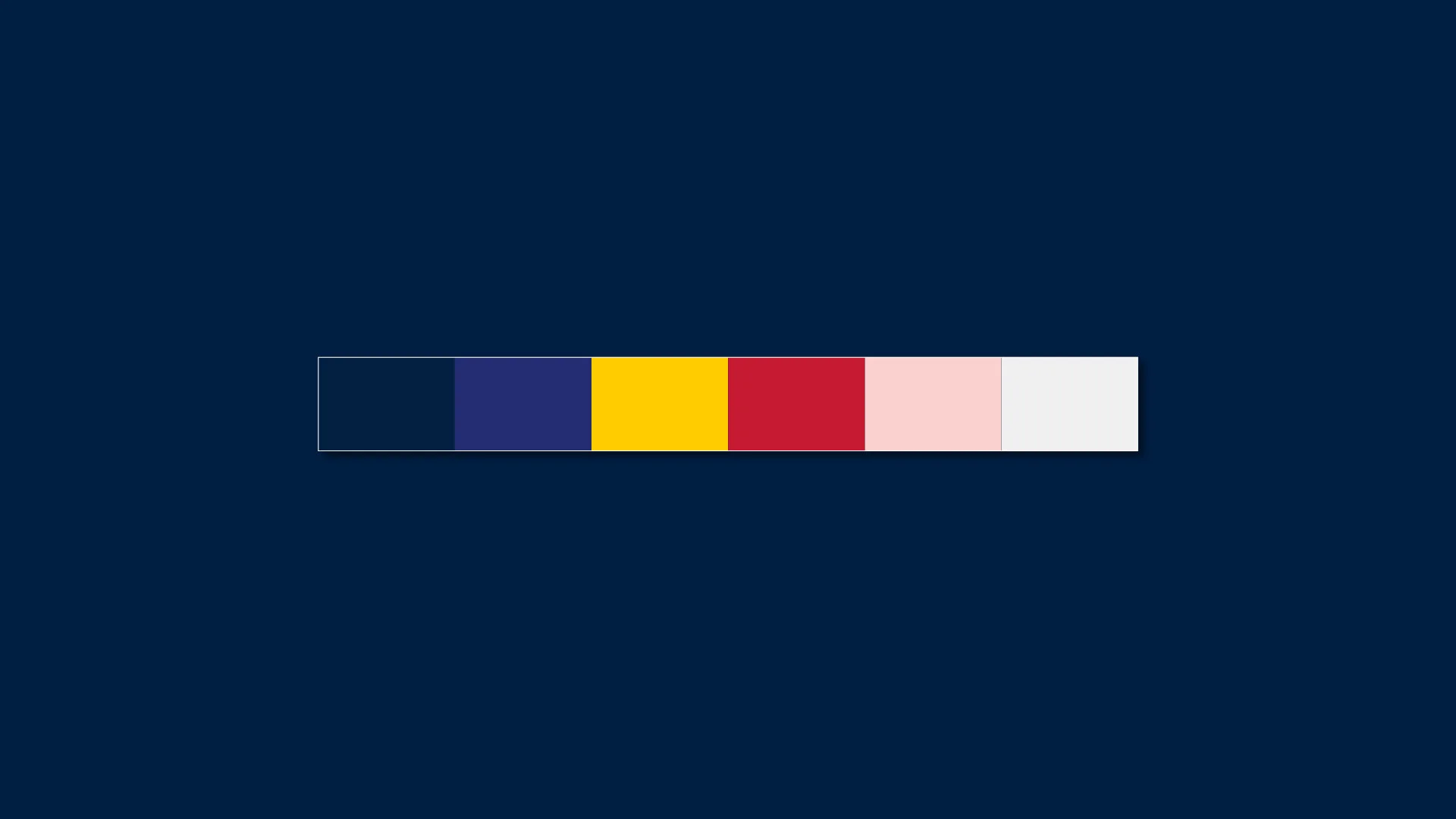
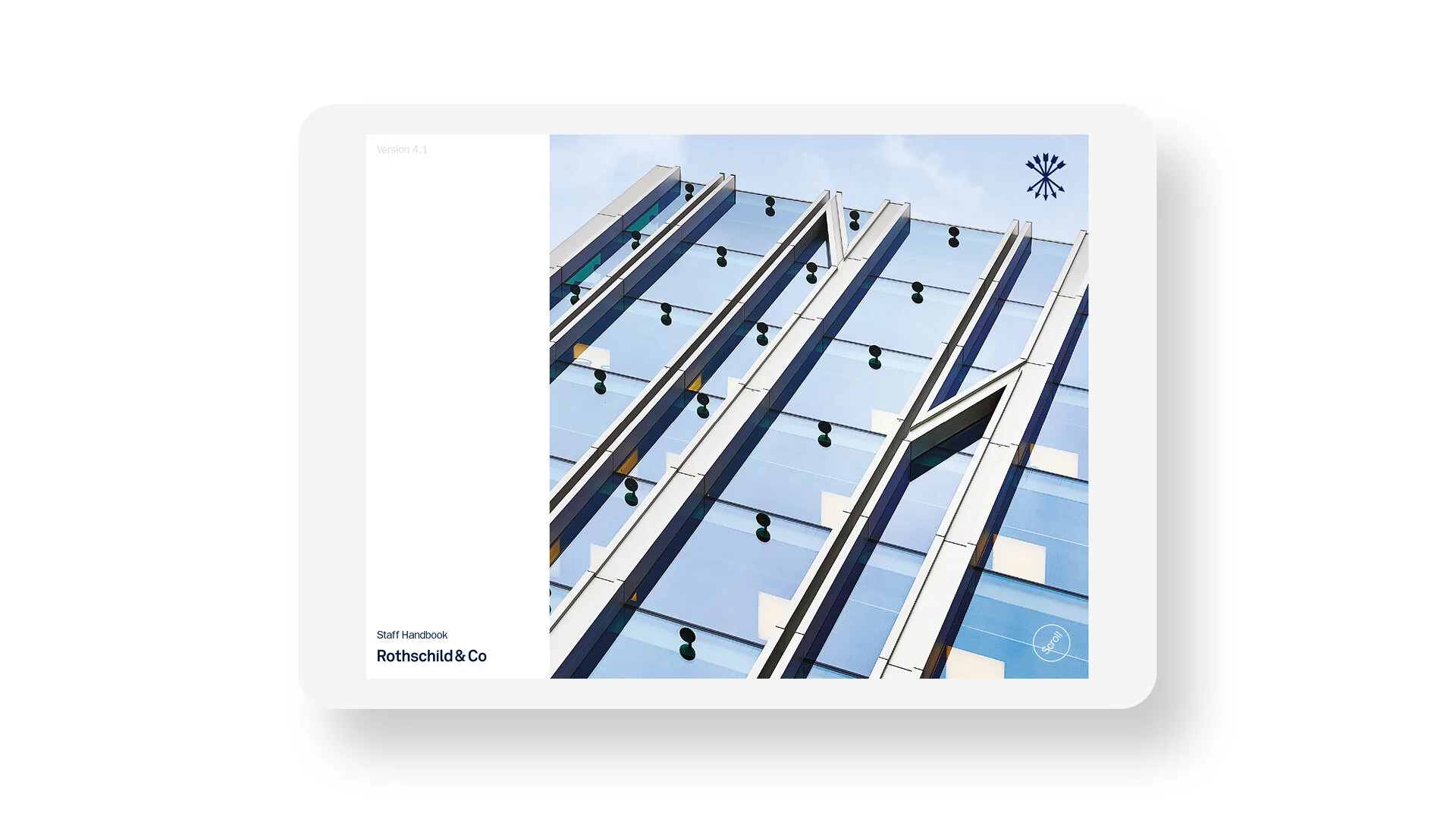
A new modernisation of the wordmarque and symbol was supported by a strong confident colour palette, typeface and visual language. A new suite of photography that reflected their rich heritage whilst focusing on the future dug deep into the 200 year archive whilst capturing the perspectives of their landmark buildings across the globe. An extensive guideline for both print and the web experience was developed as well as brand book and series of brand films to realise the transformation. The brand was launched consistently across 40 markets spanning the corporate brand and It’s multiple divisions.